When NASA prepared the first Artemis mission, the agency was doing more than assembling a heavy-lift rocket and a deep-space capsule. It was also making a statement about identity, continuity and the materials engineering behind flight-ready surfaces. The return of NASA’s red “worm” logotype to the Space Launch System, or SLS and the Orion spacecraft was presented publicly as a design milestone, but it also offered a revealing look at how coatings, decals, masking methods and surface finishing are handled on modern aerospace hardware.
The story came from NASA’s Kennedy Space Center during Artemis I processing, when teams applied the historic logo to visible parts of the rocket and spacecraft. For many spaceflight followers, the visual change was nostalgic. For engineers and technicians, it was a precise industrial task. The logo had to be sized correctly, placed accurately on curved hardware, finished cleanly and made durable enough to survive processing, launch exposure and mission operations.
That combination of branding and function makes the episode unusually relevant for readers interested in materials and industrial technology. Even a simple graphic on a launch vehicle involves surface preparation, paint selection, geometry control, adhesive performance and environmental durability. In other words, it is a finishing problem and finishing problems in aerospace are rarely trivial.
A classic NASA mark returns on flight hardware
The “worm” logo, with its continuous red lettering, was first introduced in 1975 and became strongly associated with NASA’s modernist visual identity. It was retired in 1992, while the better-known blue “meatball” insignia remained in wider use. NASA brought the worm back in 2020 as the agency entered a new era of lunar exploration under the Artemis program.
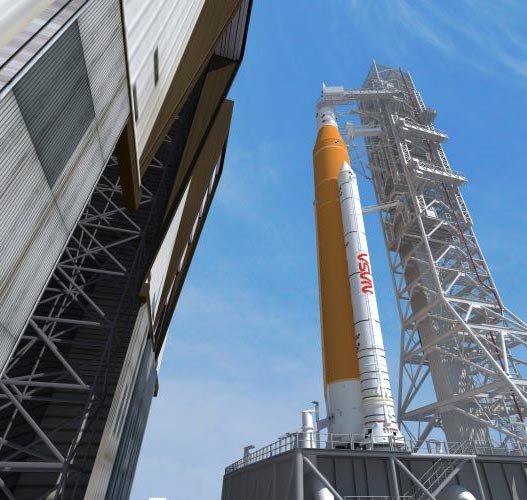
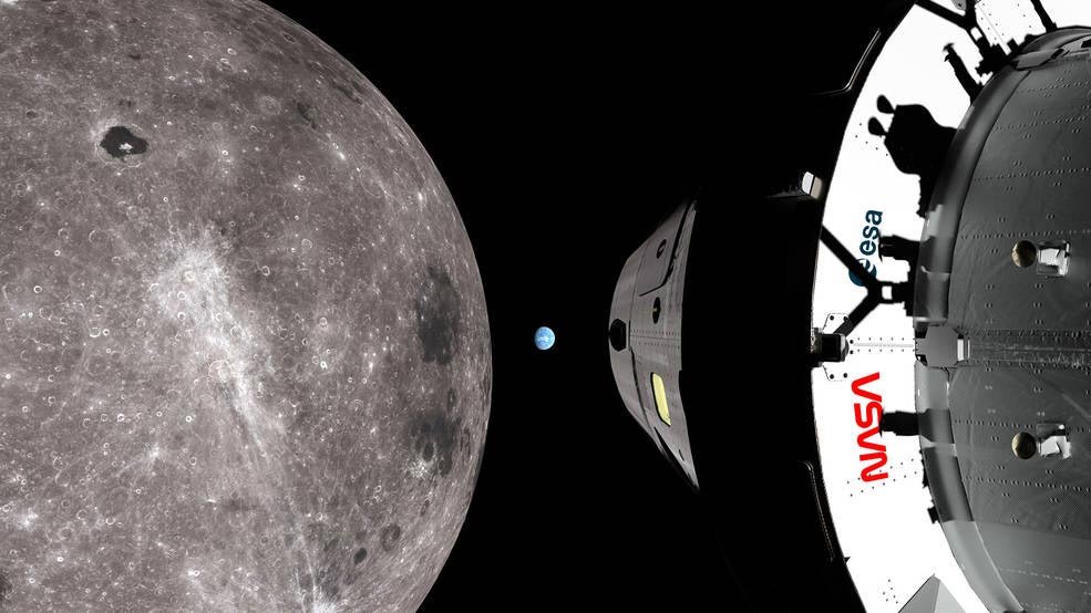
For Artemis I, NASA decided the logo should appear not just in press graphics or promotional material, but directly on the hardware. Teams at Kennedy placed the worm on the twin solid rocket boosters of the SLS and also on Orion, the spacecraft designed to travel around the Moon and return to Earth. The result linked a recognizable design element from NASA’s late-20th-century history with a vehicle intended to open a new period of human exploration beyond low Earth orbit.
Richard Danne, of Danne & Blackburn, the team that originally created the logo, said the return of the mark on Artemis hardware was especially meaningful because it was tied to an ambitious new mission. That reaction is understandable, but the technical side of the project is equally worth attention. A bright red logotype may look simple in photographs. On a launch system, it has to be executed with the same care given to any exposed external surface.
The boosters were especially prominent. NASA said the worm would be visible while the hardware was stacked in the Vehicle Assembly Building, while the rocket stood on the mobile launcher and at the pad and again as the vehicle ascended through Earth’s atmosphere. Visibility from long-range cameras and broadcast imagery clearly mattered. So did the ability of the finish to remain intact and legible during prelaunch handling.
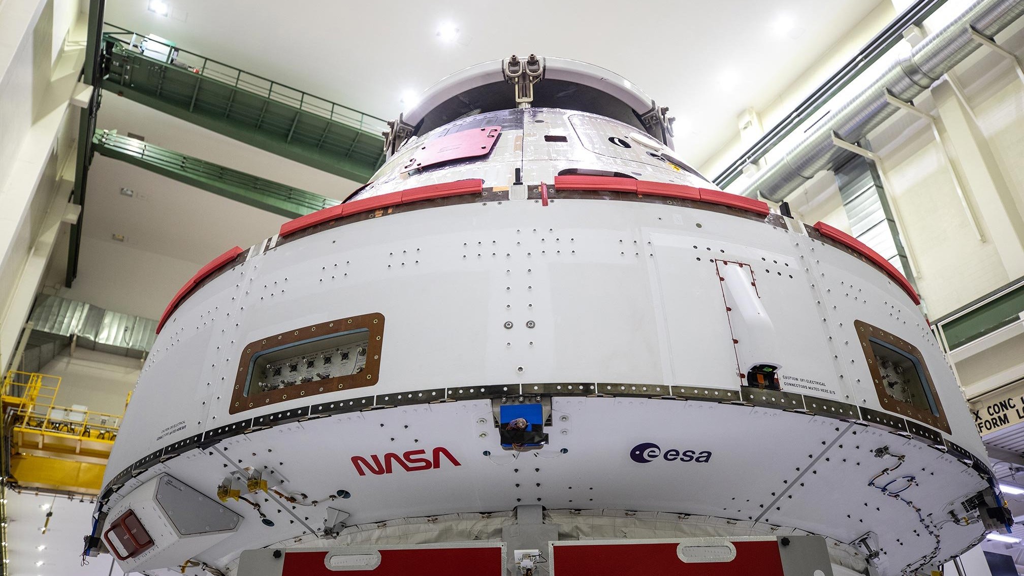
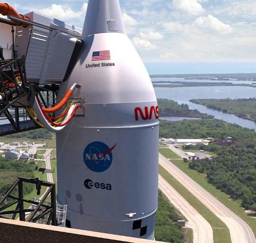
The same design logic extended to Orion. NASA and European Space Agency markings were applied to the underside of Orion’s crew module adapter, a location selected so cameras mounted near the ends of the spacecraft’s solar arrays could capture the graphics during the trip to the Moon and back. That is an elegant reminder that external markings today serve not only people on the ground but also onboard imaging systems, documentation teams and public outreach efforts throughout a mission.
Painting the SLS boosters was a geometry and process challenge
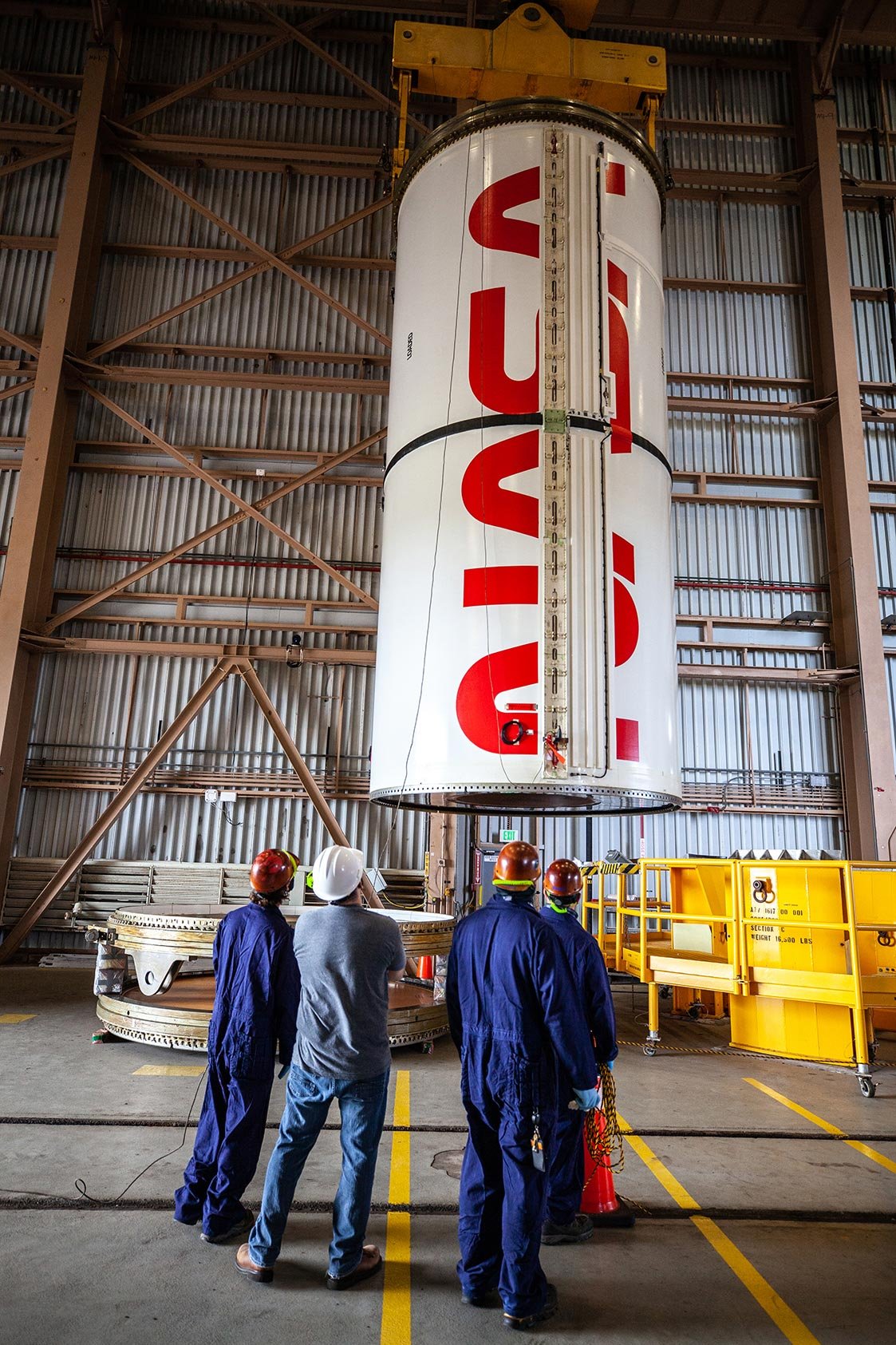
NASA said the worm began appearing on the SLS solid rocket boosters in late August, when workers from Exploration Ground Systems and contractor Jacobs started painting the design across two booster segments. The approach was not a rough stencil job. Instead, the team used a laser projector to lay out the logo so they could mask it accurately with tape before painting.
That detail is important. On large, curved aerospace structures, positioning a graphic by eye can introduce errors in scale, angle and line quality. A logotype that looks balanced on a flat drawing can distort noticeably when transferred to cylindrical hardware. Laser projection allowed the team to establish the correct dimensions and alignment directly on the surface, improving both precision and repeatability.
After masking, technicians applied a first coat of paint inside Kennedy’s Rotation, Processing and Surge Facility. NASA then said the finish was completed with a second coat followed by multiple clear coats on the booster. Even without a published formulation, that sequence tells a familiar industrial story. The color layer establishes the graphic, while the clear layers protect it and help maintain visual integrity during handling and exposure.
William Richards, an engineer with Jacobs supporting booster stacking operations, described the hardest part as identifying the correct size and location for the logo. He specifically noted that the new laser technology helped the team shape the letters properly, especially the curve of the “S.” That comment may sound minor, but it illustrates how aesthetic precision and engineering practice meet on real hardware. A distorted curve would not threaten the mission, but it would undermine the visual intent of the mark and reveal process limitations immediately in photography.
From a materials perspective, the booster application highlights several common considerations in aerospace finishing:
- Surface conformity: the graphic had to sit correctly on a large curved segment.
- Layer build: base color and clear coats had to produce a durable, uniform finish.
- Handling tolerance: the painted area had to survive transport, stacking and prelaunch operations.
- Environmental exposure: the finish needed to remain stable under Florida humidity, outdoor pad conditions and ascent loads.
NASA did not provide chemistry details for the paint or clear-coat system, so it would be wrong to speculate about exact polymer types or resin families. Still, the function is easy to recognize. Aerospace topcoats and protective clears are chosen not only for color and gloss but also for adhesion, weather resistance, abrasion tolerance and compatibility with the underlying substrate and processing schedule.
Another telling detail is that an access panel would later be secured across the middle section of the boosters and painted to complete the insignia after transfer to the Vehicle Assembly Building. That means the logo was effectively engineered across assembly boundaries. It was not just dropped onto a finished article. The visual system had to be coordinated with the booster’s segmented architecture and the practical sequence of integration work.
Why NASA used decals on Orion instead of paint
On Orion, NASA took a different route. Rather than painting the logos directly onto the spacecraft in the same way, technicians cut the NASA and ESA emblems into what the agency described as flight-proof decals and adhered them to the underside of the crew module adapter. This was not simply a cosmetic variation. It suggests a design choice based on surface geometry, access, schedule and the performance needs of that location.
Decals can offer advantages where clean edge definition is critical, where localized placement is needed late in processing, or where direct painting is less convenient for surrounding systems and interfaces. A well-designed aerospace decal still represents a serious materials challenge. The film and adhesive system must remain attached through handling, vibration, changing temperatures and prolonged exposure in space. It must also avoid peeling, bubbling, or contaminating nearby hardware.
For polymer and coatings readers, this is where the story becomes especially interesting. A “flight-proof” decal is not a simple sticker. It is better understood as an engineered laminated marking system. Such systems generally depend on a controlled film construction, a stable adhesive layer and a carefully prepared surface. Even minor edge lift could become unacceptable in aerospace use, particularly on a spacecraft expected to operate for weeks beyond Earth orbit.
The placement on Orion also reflected mission imaging strategy. ESA is providing Orion’s service module, the component that supplies power and propulsion during most of the trip. By placing the NASA worm and ESA logo where cameras on the solar arrays could see them, the teams ensured that the international partnership would be visually present throughout the mission, not only at launch.
NASA said technician Frank Pelkey, who had previously painted the U.S. flag on the spacecraft that flew Exploration Flight Test-1, affixed the decals to the Artemis I vehicle. His role underlines how much these applications depend on highly skilled hands, even when the materials themselves are advanced. Precision finishing often combines digital layout tools and engineered products with technician judgment built from experience.
Graphics on spacecraft have to survive very different environments
The worm logo’s return also illustrates a broader point: external graphics on space hardware experience sharply different environments at different mission stages. A painted booster segment at Kennedy must withstand indoor processing, outdoor transport, pad weathering and the mechanical and thermal stresses associated with launch. A decal on Orion’s adapter must tolerate not only launch but also vacuum, radiation exposure and thermal cycling in deep space.
That does not mean every logo on a spacecraft is exposed to the harshest possible conditions all the time. Placement matters. The Artemis I graphics were located on visible structural surfaces, not on heat-shield regions or the most extreme thermal protection areas. Still, their survival is not automatic. The coatings and decals had to remain functional and visually coherent in environments far more demanding than those seen by ordinary industrial labeling systems.
NASA’s plan extended beyond the first set of applications. The agency said additional graphics would later be added to the crew module, including an American flag and the blue “meatball” insignia, as well as another worm decal on the outer band of the crew module adapter. ESA and NASA markings were also slated for fairings covering the service module, with U.S. identifiers on other launch elements. In practical terms, Artemis I became a carefully coordinated external graphics program spread across multiple assemblies and processing milestones.
That is a useful reminder that aerospace finishing is often distributed work. Different markings may be painted or applied in different facilities, by different teams and at different times, depending on when the underlying hardware becomes accessible. The finished visual result may appear unified, but achieving that unity requires detailed documentation and process control.
An industrial case study hiding inside a public-relations moment
At first glance, NASA’s announcement was about design heritage and public excitement ahead of Artemis I. But looked at through an industrial-science lens, it becomes a compact case study in applied surface technology.
The booster work involved digital positioning, masking, multi-layer paint application and protective overcoating on large aerospace structures. The Orion work involved precision-cut decals engineered for flight use and installed on a spacecraft component in a way that preserved both appearance and performance. In both cases, the markings were not merely decorative afterthoughts. They were integrated into the mission’s visibility strategy and applied through processes compatible with strict flight-hardware controls.
The broader Artemis system also added another layer of complexity. Northrop Grumman delivered the Artemis I booster motors to Kennedy for assembly of the five-segment boosters, while NASA and Jacobs handled key ground-processing work and ESA supplied Orion’s service module. That means the external graphics effort sat within a multi-organization manufacturing and integration chain. Even something as familiar as a logo has to fit the realities of contractor interfaces, schedule constraints and configuration control.
For materials professionals, a few takeaways stand out:
- Visual elements on advanced hardware are still materials systems. Paints, clear coats, films and adhesives all carry performance requirements.
- Application method matters as much as formulation. Laser projection, masking quality and installer skill all affect the final result.
- Surface design can serve operational goals. The locations chosen for the Artemis logos were tied to camera views, not just aesthetics.
- Durability must match mission phase. Launch-vehicle graphics and spacecraft graphics may need different material strategies.
More than nostalgia
NASA’s worm logo carries emotional weight for many people, but its return on Artemis I was also a small demonstration of how modern aerospace programs handle the visible outer layer of their hardware. Rockets and spacecraft are often discussed in terms of propulsion, structures, avionics and mission design. Yet the external surface is where engineering meets the public eye. It is also where coatings science, polymer films, adhesives and finishing practice become immediately visible.
That is why this seemingly simple branding story resonates beyond design culture. The same industrial disciplines used to protect aircraft, satellites and launch systems also make it possible to place durable, accurate, camera-ready markings on vehicles headed for the Moon. In Artemis I, NASA used those disciplines to connect a new exploration architecture with a familiar visual identity.
The result was memorable for spectators, but it was built on careful process work by engineers and technicians. The worm’s return did not happen because someone wanted a retro look. It happened because teams could translate that look into a reliable, flight-compatible surface treatment across very different pieces of space hardware.
In that sense, Artemis I offered a concise lesson for anyone interested in advanced materials and industrial finishing: even the most iconic design on a rocket is only as good as the paint system, the decal technology, the placement method and the people who apply it.
Related reading
More journal reading and science coverage connected to this topic.
Polymerization Technology
A modern overview of how reaction engineering shapes polymer architecture, productivity, and scale-up.

Research on pretreatment technology for corn husk degumming
Title: Research on pretreatment technology for corn husk degumming Page Range: p.687-692 Author(s): Rong Zhou; Mingxia Yang; Haixia Zhang File size: Download the pdf…
STUDY OF DIFFUSION PERFORMANCE AND PREPARATION TECHNOLOGY OF THE COLOURED PMIA FIBRE
Title: STUDY OF DIFFUSION PERFORMANCE AND PREPARATION TECHNOLOGY OF THE COLOURED PMIA FIBRE Page Range: p.601-608 Author(s): Li-Qi Liu; Lei Chen; Zu-Ming Hu; Jun-Rong…